Untethering Front End Associates
Taking the mobile app, Engage, from problem statement to full chain rollout
An Overview
The Logistics
- Q2 2022 - Q3 2025
- Funded mobile app for Front End Associates called Engage
My Role
- I was the lead designer on Engage from initial concept to full chain rollout. I designed the screens of the initial feature set, created the initial recommendations for the go to market feature set based on experimentation, and led the research post launch.
Key Outcomes
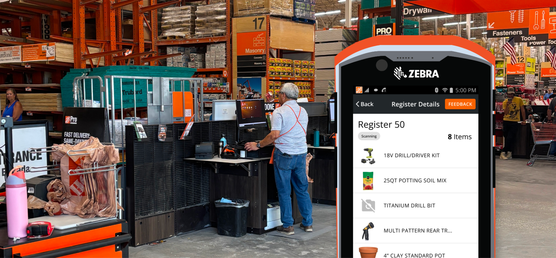
- Engages value opportunity is $186 million in annual shrink reduction & $30 million in labor re-allocaiton. This was heavily driven by our delivery of an additional 20 seconds of visibility to the cart for each transaction at SCO.
- Delivered a mobile tool to chain designed with Material UI that enhanced visibility to our store associates. Tool continues to deliver on ease of use and capabilities maintaining a UX Lite score >80 in FY26.
Final Solution

Problem Statement
We have observed that today, associates miss key moments in selfcheckout to get involved to ensure customer scan accuracy, resulting in disengaged associates and a decrease in front end accuracy.
Hypothesis
We believe by introducing a unified tool we will increase associate confidence and engagement levels enabling a more accurate, faster, and adaptable SCO experience by providing multiple register insights, directed engagement, and remote intervention resolution.
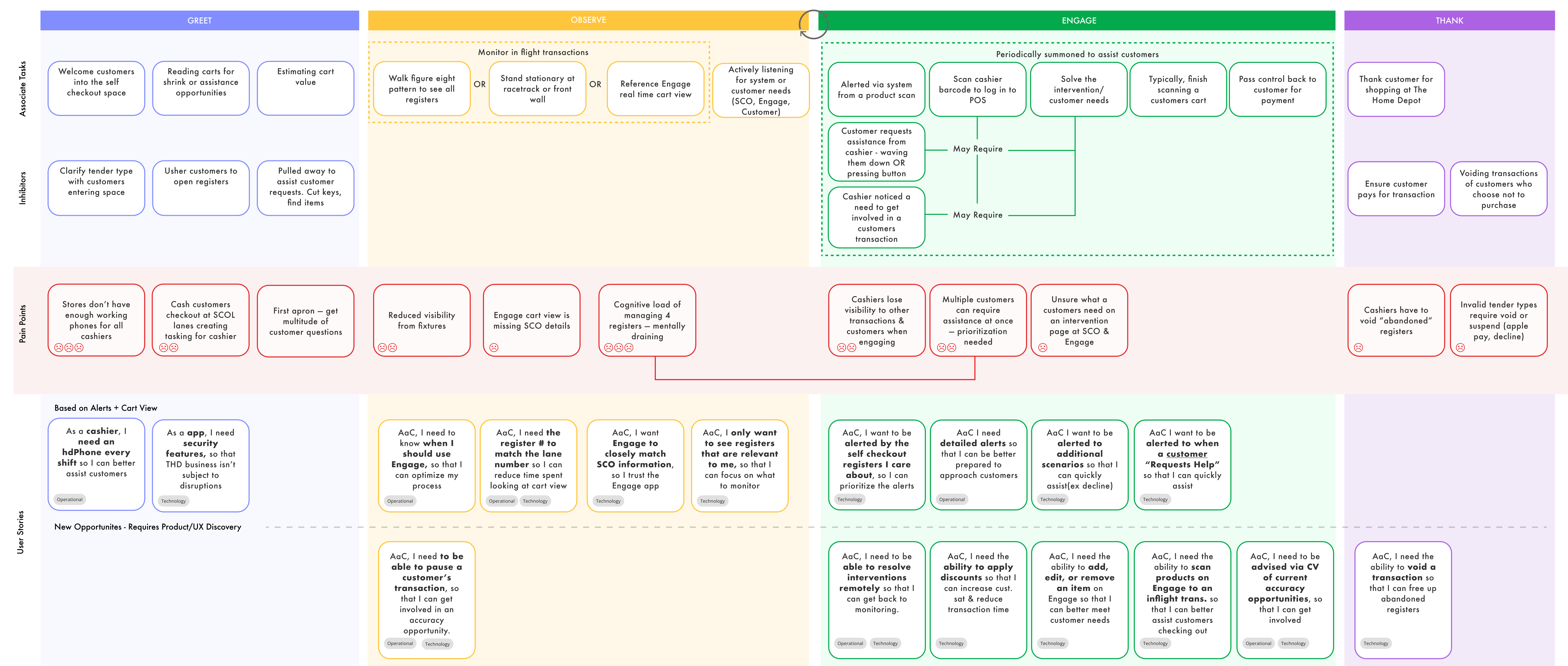
Our Personas


Process to Define the MVP
Narrowing to an MVP Feature Set
To accurately address the problem statement Engage needed to provide a feature set that increased an associates confidence to get involved in transactions at the front end and provide enhanced visibility to reduce the risk of shrink/swell through checkout.
Our product team hosted multiple ideation sessions to narrow in on a set of features that we believed were low enough level of effort but still met the needs of our hypothesis. I follow a Lean UX methodology so we set up experiments to test these feature sets before building the full scalable solution.
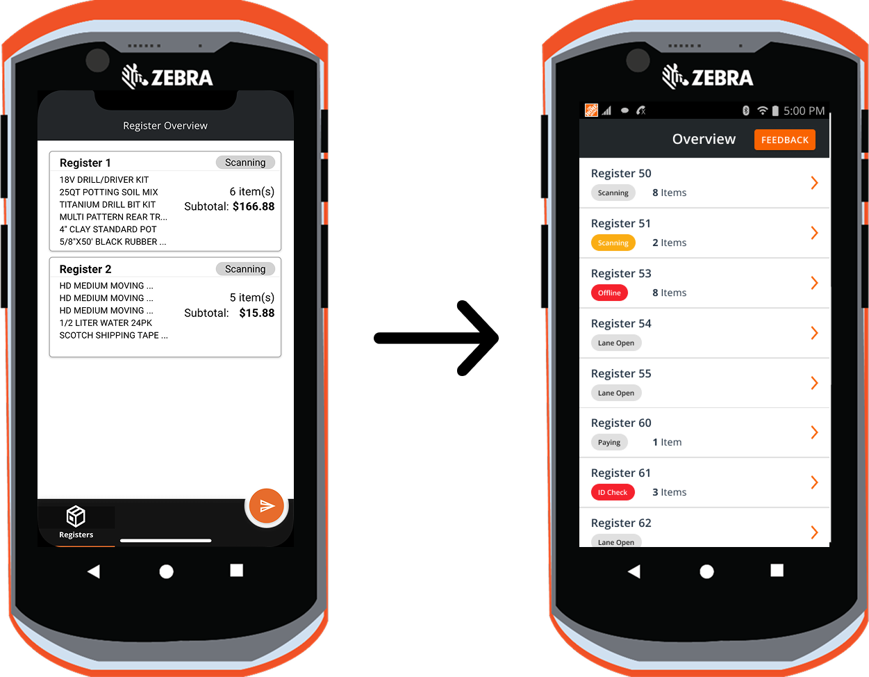
1. Realtime Cart Visibility
Experiment Hypothesis
We believe that providing real time cart view for cashiers will achieve a reduction shrink and increase in cashier confidence when engaging.
Assumptions to Test
- Cashiers know what an inaccurate transaction looks like digitally & physically
- Cashiers will use engage to periodically check on the status of a cart
Test Scenario
- Cashiers were given prototype and told to leverage the device to ensure the transactions were accurate
- The prototype updated real-time via a second prototype
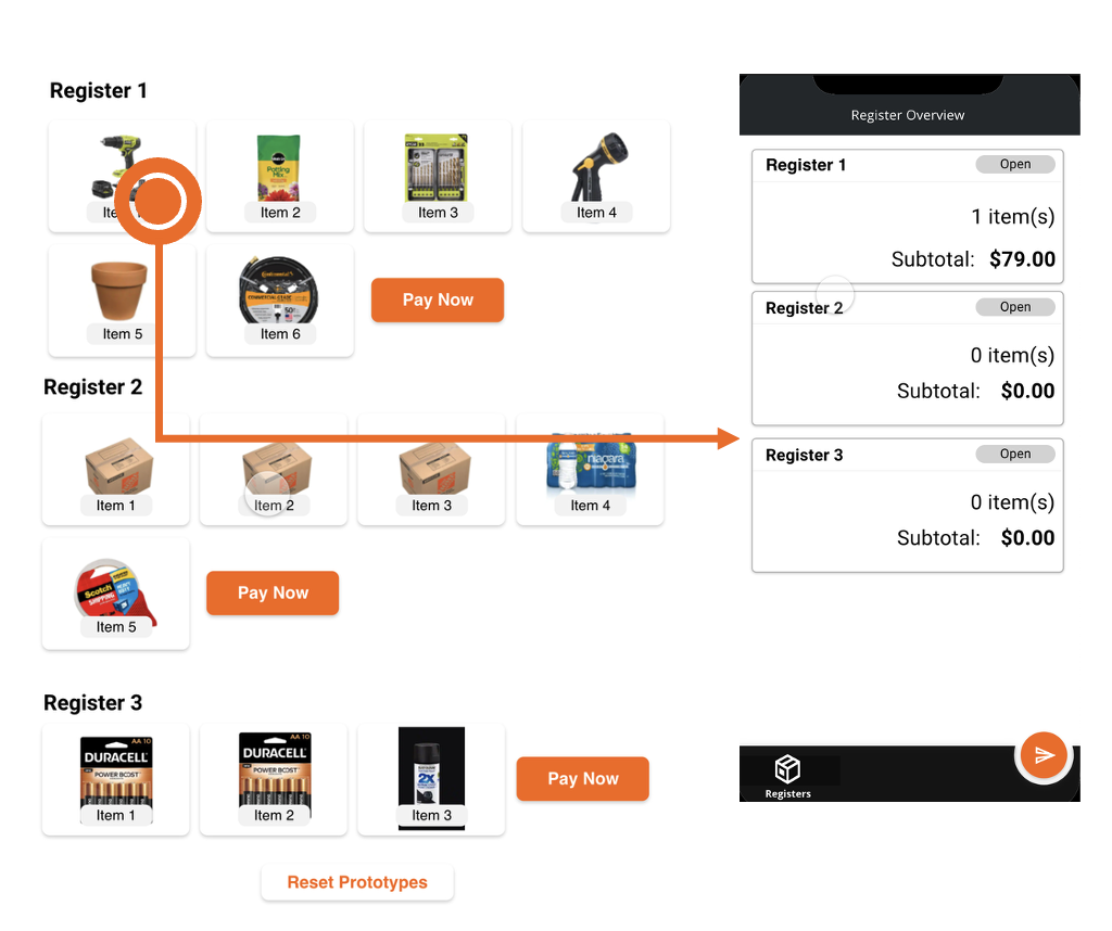
Approach
- One of the transactions being monitored was purposefully inaccurate
- Gathered insights before the test around current state of monitoring
Experiment Results
- Concept was well received but ineffective
- Received plenty of positive feedback from cashiers – mirrors positive feedback received in early concept testing
- 5/8 associates did not notice the inaccuracy with Engage
- 3 Cashiers that did spot the inaccuracy were in a reduced 1:2 ratio
- Conflict of business goals and cart view behaviors
- Realtime Cart View may encourage cashiers to stand back with device over getting involved
- 5/8 cashiers mentioned getting involved in every transaction to ensure accuracy
- ”I wouldn’t want my cashier to be looking at the phone” – Front End Supervisor
- Currently cashiers use a mix of physical and digital cues to ensure accuracy
- 6/8 cashiers mentioned comparing a customer’s physical action with the digital result (e.g. scanning and the line item appearing)
- Tenured associated mentioned estimating cart totals, listening for HDPP prompts, and memorizing high shrink items (electrical)
Post Experiment Recommendations
- Continue: Realtime Cart View
- Redesign Realtime cart view for reference over passive consumption
- Stay Connected: Computer Vision Efforts
- Opportunity to mix the physical and digital environment cashiers rely on
2. Proactive and Reactive Alerts
Experiment Hypothesis
We believe that if cashiers are alerted to active engagement opportunities in self checkout they will be more confident when engaging, we will see a reduction in the time to engagement, and we will observe associates conducting additional accuracy behaviors.
Test assumptions
- Associate will have stable acces to HDPhones
- Associates will use the alert as a primary feedback mechanism that a customer needs assistance in Self Checkout
Experiment Flow

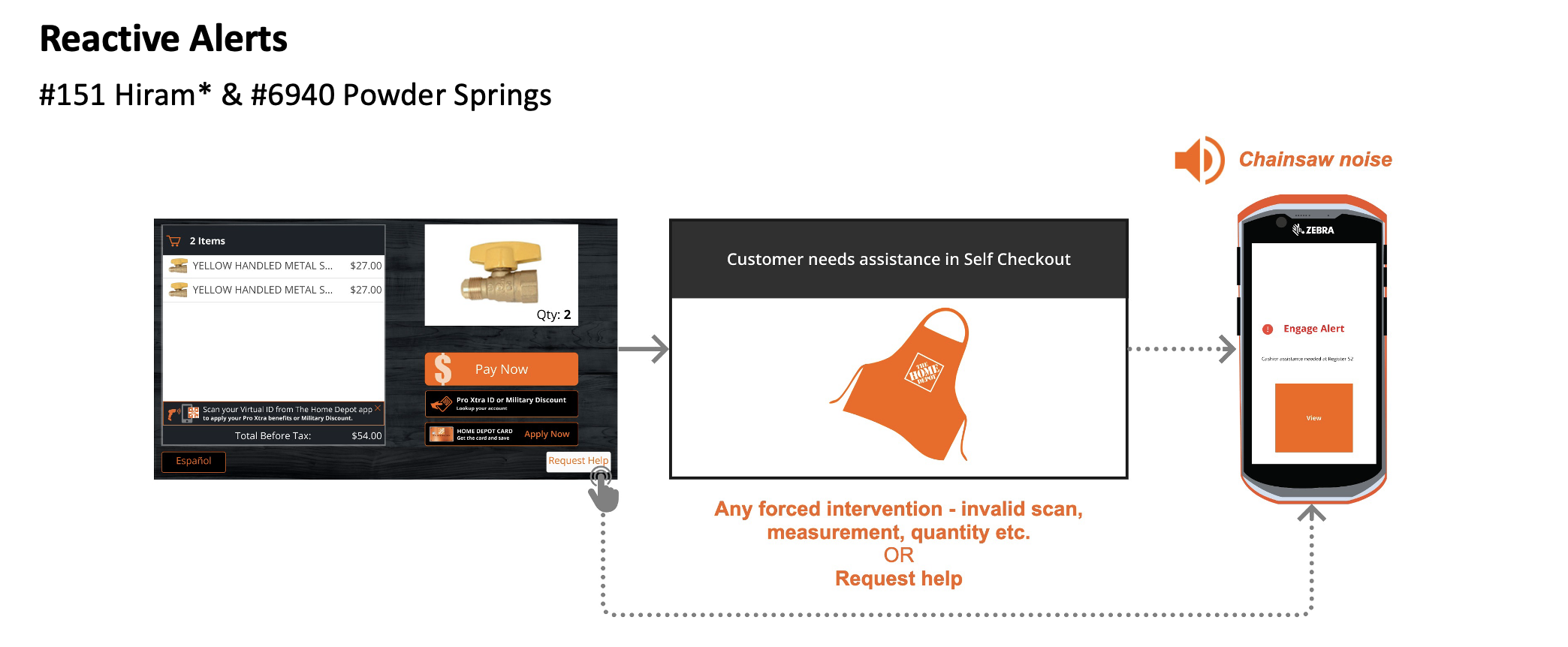
Experiment Results
- We sent 45 reactive alerts per day & 1 proactive alert per day
- ~15% (46/301) of transactions per day resulted in an alert
- With revisions associates feel both alerts provide value to the front end
- Helpful when monitoring “Register 52 is too quiet, this morning the phone alerted me to a customer waiting” - #0151 Head Cashier
- Helpful for leaders “It goes off the majority of my shift, but it gives me a sense of how busy it is. If it keeps going off, I know to come to the front end” - #6940 Head Cashier
- Not enough phones for all front-end associates
- Both #0151 Hiram & #6940 Power Springs noted frequent issues having enough phones SCO cashiers did not hold phones at #6940 Powder Springs
- Alerting to too many actions - cashier behaviors & customer behavior
- “I don’t like when it tells me when I click request help, it’s not useful” – Head Cashier #0151
- Alerting too many associates in the front end – alerting anyone with the title “cashier” including pro & garden areas
- “I want to be able to select Self Checkout and get the alerts” – #0151 FES “this is so annoying. I don’t need to be notified (when I am not at SCO)” - #0151 Mainline Cashier
Post Experiment Recommendations
- Continue to refine the alert experience, connect with cross-functional team to look for opportunities to reduce latency and enhance usability of the alert.
3. Ability to Pause an In Flight Transaction
Experiment Hypothesis
We believe that if cashiers have the ability to stop a transactions we will achieve a reduction shrink and increase in engagement in accuracy opportunities.
Test assumptions
- Pause was tested as a standalone feature to focus the associate’s feedback
- Associates would leverage the tool to get involved not just their current engagement methods
Scenario
Associates were given a UX prototype, shown functionality, and told to ensure the volunteer’s transaction was accurate. The volunteer had a tote with a product hidden inside.


Experiment Results
- Overall positive results for the SOP scenario - 66% of associates performed the accuracy behavior & found the hidden item
- Store culture impacted how associates reacted to the concept. #130 Cascade identified accuracy benefits, #121 Cumberland focused more on the customer impact and did not perform the SOP
- Mixed perception of value in functionality - “this is an extra step I’d rather get involved directly” & “I’d rather just go up to the customer”
- Cashiers identified “malicious customers”, LANA, and cart complexity as additional use cases
Post Experiment Recommendation
We need to further understand -
- Operational strategy for store use – avoid “blame the system” terminology
- Mitigate opportunity for bias/profiling – limit the functionality to select transactions?
- Recommendation is not to pursue pause transaction as an MVP feature
3 Store Pilot to Full Chain Rollout
We phased our rollout of Engage from 3 stores → 10 stores → 30 stores → 210 stores → full chain rollout. We were able to accelerate our rollout timeline because we stayed close to the field with feedback. We went from our 3 store pilot to full chain pilot in less than a year, ahead of our expected schedule.
We leveraged a UX Lite survey to score our application on ease of use and functionality. We also collected feedback both in person and through in app surveys that helped drive our roadmap paired with business alignment.

Our quartely planning was driven by a journeymap I kept up to date. We leveraged things like the RICE prioritization technique to priortize a large backlog of capabilities. Because Engage was a net new application to the Front End we were often overwhelmed with possibility and different directions we could take, ruthless prioritization and and a data driven approach was key to our roadmap strategy.
Quotes
"Thank you, Morgan, for your work on the Engage mobile app that led to a successful chain launch on 1/23/24. This milestone launch lays the foundation for mobility in the front end and was built with UX leading the way in future concepts for this functionality just 2 years ago. Usage continues to be strong with 92% of stores using the app on the first day. Medallia and Viva engage feedback also continues to be positive with store associates saying they, "Love the real time scanning. It helps with theft and shrink."
– Director of Customer Experience
"Thank you for the amazing work to design the company on the future of the Front End. We have more to do but you have created the momentum needed!"
– Sr. Director of Store Operations
Lessons Learned
The last feature I worked on for Engage was our Associate Authentication feature.
Problem Statement
Currently cashiers have to print a QR code every day in order to access the register. This is a waste of receipt paper (a hormone disruptor) and it disrupts the customer flow in the environment. Our strategy from the start of Engage was for it to be a modern cashier toolkit and this included removing these old school methods.
The Solution
This feature became a lesson learned, and was the last feature I touched on Engage before transitioning it to another lead designer. We were excited about this capability and I led multiple design sessions with my product and engineering team to develop a more modern solution for the login problem.
Our business team got very excited by the opportunities as this also was our initial inroad to Engage having register impacting functionality (e.g. a cashier could soon take action on Engage to impact the register, like add birthdays!). I was invited to present a prototype of Engage to Ted Decker on a store walk! I demoed a high fidelity prototype of Engage to Ted. We were in the middle of technical research on this feature at that time, but I had wrapped up the concept research and we felt confident in the solution.
The demo went really well and we received accelerated funding to push this work faster, but the work halted. We uncovered big cybersecurity concerns over the feature and our engineers worked tirelessly quarter after quarter to find a solution. From the business side it looked like they spent an extra million dollars for no return, on a solution they watched a demo of many months prior.
I quickly realized lack of visibillity was killing our momentum and causing us to swirly every week, so I created high level diagrams that could be understood by our businss partners to tranlate where we were in the development process. We gave status updates every week to show we were indeed making progress.

During this time we pushed out other meaningful changes but this big feature was stalling out. Engage’s funding ran out, and I had already transitioned off the team, before this feature could ever be released. This was a huge lesson for me in fidelity and something I immediately brought in to my next workstream, the emerging experiences lab.
Ted saw, and presumbly got excited, about something that looked real. This high fidelity prototype showcased the possible. A combination of that final state view, our demo, and overpromising on our roadmap led to distrust from our stakeholder group. We didn’t deliver on our timeline and I strongly believe if we had pulled our agile cycles to be tighter (UX and product not too far ahead of dev) and showcased a lower fidelity demo - any misunderstandings could have been greatly mitigated. Likewise this taught me failure and the capacity to sit learn from it has to be taught. We cant assume all verticals are comfortable that failure = progress.